← Layout and components

Layout and components: recap

Answer each question in your head or on paper first, then check it.

Rules that combine

1. Which rule wins

Try firstA paragraph matches p { color: teal; font-size: 20px; } and .note { color: crimson; }. What colour and size is it?

Check your answer

Crimson and 20px. It takes both rules; where they clash on colour, the class rule wins.

The video and the picture show the same steps:

  1. A rule on p turns every paragraph teal.
  2. The marked paragraph matches a second rule, .note, so it takes the size from it too.
  3. Where both rules set the colour, the class wins.
  4. A comma gives two selectors one rule: h1, p { }.

In the picture, the marked paragraph is crimson and 24px, and the plain paragraphs and the heading are teal.

The page this code makes
What this code makes
Every matching rule applies, a class beats a tag, and a comma shares a rule · Sound on for the voiceover
Open the lesson →

Boxes

3. Block and inline boxes

Try firstWhy does a gold background on a span reach only its words, and on a div the whole width?

Check your answer

A span is inline, so it is only as wide as its words. A div is a block, so it takes the full width of the page.

The video and the picture show the same steps:

  1. The span's gold hugs its words. The div's gold runs across the page.
  2. A block starts a new line and takes the full width.
  3. An inline box sits inside the line of text.
  4. display: block makes the span act like a div.

In the picture, Boxes is on: the div's box fills the width, and the span's box is only as wide as its words.

The page this code makes, with Boxes on
What this code makes (with Boxes on: each box is a tag)
A block takes the full width, an inline box sits in the line · Sound on for the voiceover
Open the lesson →

4. Boxes

Try firstA box has width: 300px; padding: 10px; border: 2px solid; How wide is it on the page, and why?

Check your answer

324 pixels: 300 for the content, plus 10 padding on each side (20) and 2 border on each side (4).

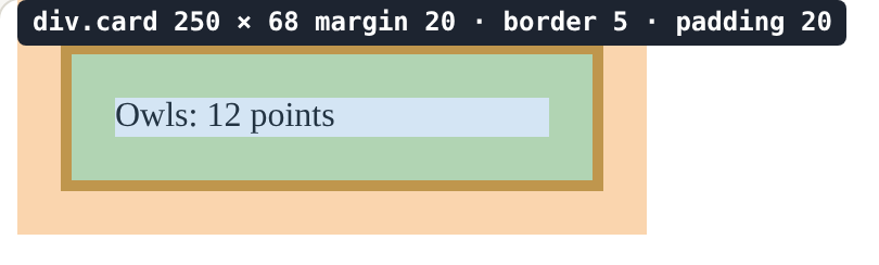
The video and the picture show the same steps, in the Box model view:

  1. Every element is a box. The words are the content (blue).
  2. padding (green) adds space inside, around the content.
  3. border (gold) is the line around the padding.
  4. margin (orange) is space outside the border, between boxes.
  5. width sets the content only, so this card is 200 + 20 + 20 + 5 + 5 = 250 pixels wide.

Every size needs a unit, such as 20px. Without one, the browser ignores it, with no error message.

The page this code makes, with the Box model view on
What this code makes (Box model view: margin orange, border gold, padding green, content blue)
Every element is a box: content, padding, border, margin · Sound on for the voiceover
Open the lesson →

5. Turn the newsletter into cards

Try firstA page has h1, h2 { color: navy; } and then h2 { color: teal; }. What colour is an h2, and what colour is the h1?

Check your answer

The h2 is teal, because the later rule wins where both set the colour. The h1 matches only the first rule, so it is navy.

Open the lesson →

Layout

6. A row with Flexbox

Try firstA student wants three cards side by side. They write .card { display: flex; } but the cards still stack. What is wrong, and what should they write?

Check your answer

display flex is on the items. It goes on the box that holds the cards, for example .cards { display: flex; } with the cards inside a div with class cards.

The video and the picture show the same steps:

  1. A list stacks its items, one under another.
  2. display: flex; goes on the box that holds the items: here the ul (the parent).
  3. Its children, the li items, now sit side by side in a row.
  4. On each li instead, it does nothing for the row: the items need a parent to line them up.

The rule to remember: Flexbox goes on the parent, and the children line up.

The page this code makes
What this code makes
display: flex on the parent lines its children up in a row · Sound on for the voiceover
Open the lesson →

7. Space out a row

Try firstA flex row has justify-content: center. Which way do the items move, and what happens to the words inside each item?

Check your answer

The group of items moves to the middle of the row. The words stay where they are inside their item.

The video and the picture show the same steps:

  1. display: flex puts the items in a row, bunched at one end.
  2. justify-content: space-between sends the first item to one end and the last to the other.
  3. align-items: center centres the items across the row.
  4. gap is the least space between neighbours.

In the picture, the bar is 100px tall so you can see the items sit halfway down.

The page this code makes
What this code makes
justify-content places items along the row, align-items across it · Sound on for the voiceover
Open the lesson →

8. Fit any width

Try firstA gallery uses flex: 1 and min-width: 150px. Why does it show four cards on a line on a laptop but one on a phone?

Check your answer

A line holds as many 150px cards as fit, and flex: 1 stretches them to fill it. A phone only has room for one, so the others wrap.

The video and the picture show the same steps:

  1. Six cards in one flex row do not fit, and stay in one line.
  2. flex-wrap: wrap lets cards drop to a new line when there is no room.
  3. flex: 1 makes the cards on each line share the spare room.
  4. min-width is the narrowest a card may get before it drops to the next line.

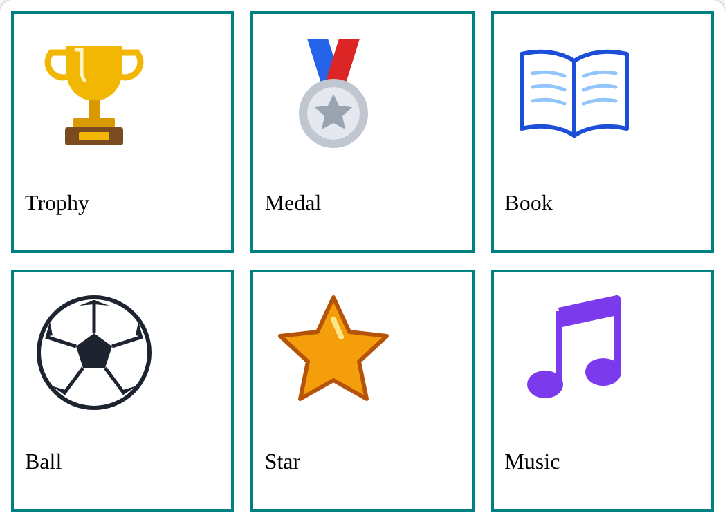
In the picture, the preview is narrow, so the cards sit in lines of two or three. A wider screen holds more on each line, with the same rules.

The page this code makes
What this code makes
flex-wrap lets a row drop items onto new lines when it runs out of room · Sound on for the voiceover
Open the lesson →

9. A hero and a row of cards

Try firstA page has ten cards, all class card. How many .card rules does it need, and how do you add an eleventh card?

Check your answer

One rule. Copy the HTML of a card, change its words, and the rule already styles it.

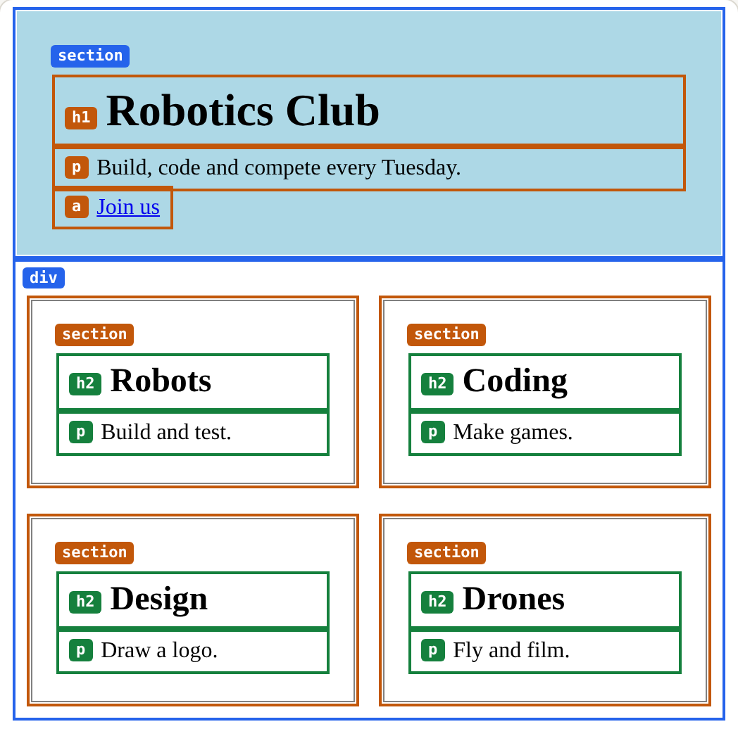
The video and the picture show the same steps (Boxes is on, so each card shows as a box):

  1. Each card is a <section> with the class card: a chunk of HTML.
  2. One rule, .card, styles every element with that class.
  3. For a fourth card, copy a card's HTML and change its words.
  4. No new CSS is needed: the new card already looks like the others.

The hero works the same way: a section with a class and one rule.

The page this code makes, with Boxes on
What this code makes (with Boxes on: each box is a tag)
A copied component is styled by the same rules · Sound on for the voiceover
Open the lesson →

Final challenge: lay out the club page

10. Challenge: lay out the club page

Try firstName three parts of your layout and the rule behind each.

Check your answer

For example: the name left and the menu right is display flex with justify-content space-between on the header; the cards share one .card rule; the cards wrap because the row has flex-wrap wrap.

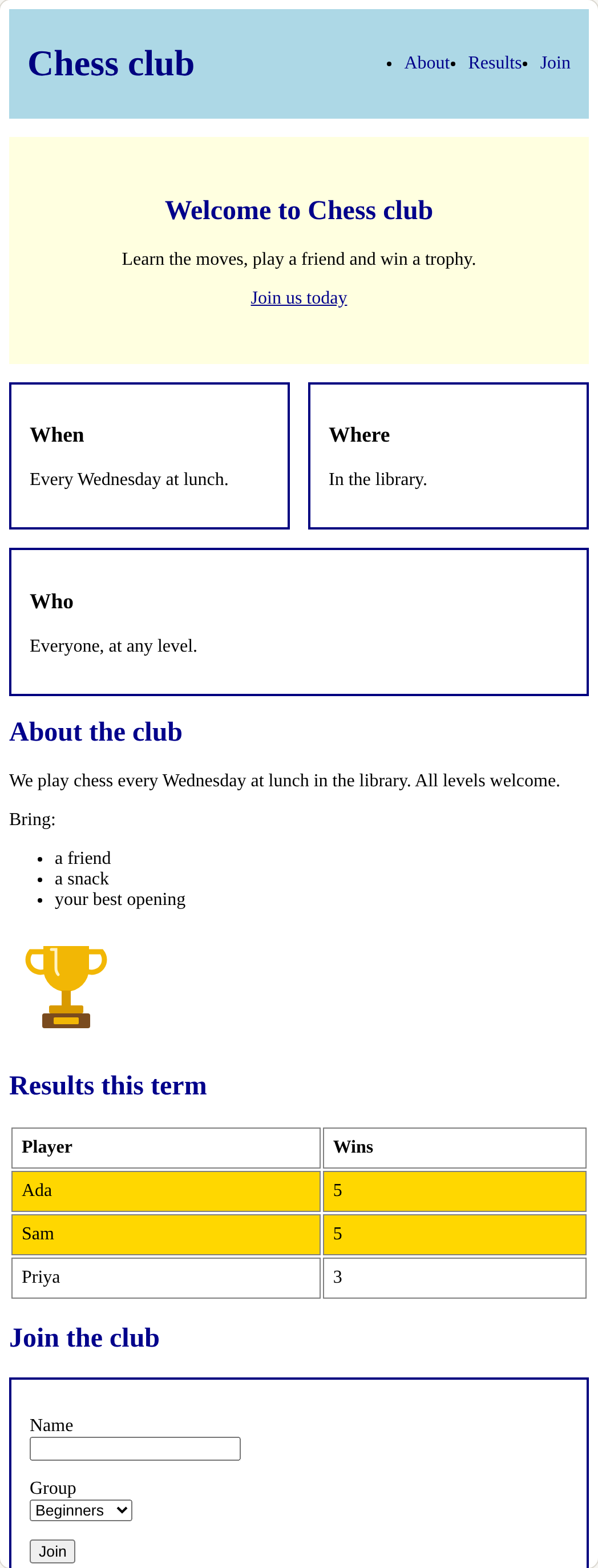
The picture shows the laid-out page. Build it in this order, one milestone at a time:

  1. Header and menu: Flexbox on the header and on the menu list, and nav a for the links.
  2. Hero and cards: a hero section and a wrapping row of cards that share one class.
  3. Table, form and footer: padded cells, the form as a card, and a padded footer.

Check the page after every change.

The page this code makes
What this code makes
Open the lesson →