A row with Flexbox
Put boxes side by side in a row with Flexbox, and find out that it goes on the box that holds them.
Almost every menu bar, toolbar and row of cards on the web is a Flexbox row.
So far, boxes stack down the page. Flexbox lines them up in a row.
- Predict: Read the code and say what it will do before you run anything. A wrong guess is fine: it shows you what to look for.
- Run: Run it and compare the result with your prediction.
- Investigate: Trace how each line of code connects to what you see.
- Modify: Change the code on purpose and check the result.
- Make: Build something new using what you have learned. Expect a few tries; that is normal.
Make your prediction first. Help opens once you've locked it in.
Predict
<style>
  ul {
    display: flex;
    list-style: none;
  }
  li {
    margin-right: 24px;
  }
</style>
<ul>
  <li><a href="https://example.com/home">Home</a></li>
  <li><a href="https://example.com/events">Events</a></li>
  <li><a href="https://example.com/join">Join</a></li>
</ul>
display: flex is new. list-style: none removes a list's bullets, and the margin-right on each li keeps the words apart. Read the code. How will the menu items be placed?
Run
Compare with your prediction. Then delete the display: flex; line to see the menu stack again, and put it back.
| Code | What it does | Why |
|---|---|---|
ul { display: flex; } |
Puts the ul's children in a row |
The box that holds the items is the parent, and its boxes inside are its children. Flex goes on the parent, and the children line up |
the three li |
Sit side by side | They are the parent's children. Without display: flex they are block boxes, and block boxes start a new line |
list-style: none; |
Removes the bullets | Not Flexbox: real menus have no bullets, so it is a tidy-up on the list |
li { margin-right: 24px; } |
Keeps the words apart | A margin on each item. Items in a row touch otherwise |
<style>
  ul {
    display: flex;
    list-style: none;
  }
  li {
    margin-right: 24px;
  }
</style>
<ul>
  <li><a href="https://example.com/home">Home</a></li>
  <li><a href="https://example.com/events">Events</a></li>
  <li><a href="https://example.com/join">Join</a></li>
</ul>
Investigate
The picture shows a row of cards: the div holds them, and each card holds a picture and a name.
<style>
  .cards {
    background-color: aliceblue;
  }
  .card {
    padding: 12px;
    border: 2px solid teal;
    margin: 8px;
  }
</style>
<div class="cards">
  <div class="card">
    <img src="trophy.svg" alt="Trophy" width="50">
    <p>Owls</p>
  </div>
  <div class="card">
    <img src="medal.svg" alt="Medal" width="50">
    <p>Hawks</p>
  </div>
  <div class="card">
    <img src="star.svg" alt="Star" width="50">
    <p>Kestrels</p>
  </div>
</div>

Look at the cards.

This should be a row.
Think about how the boxes nest.
This menu should be a row, but the items still stack, and there is no error. Click the line that picks the wrong box.
Modify
Put the menu items side by side.
Need a hint?
Flexbox goes on the parent, the box that holds the items. Which rule is that?
Another hint
Add display: flex; to the .menu rule.
Show the expected result

The three cards are stacked. Put them in a row.
Need a hint?
The cards are inside a div with the class cards. That div is the parent.
Another hint
Write a new .cards rule and put display: flex; first in it.
Show the expected result
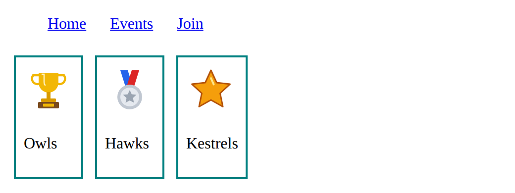
A list has space of its own around it. Remove it from the menu with margin: 0; and padding: 0;.
Need a hint?
The list has its own space around it. Which two box properties would remove it? Set them in the .menu rule.
Show the expected result

Put the menu in a row.
This ticks when your page has all of the above.
Put the cards in a row.
This ticks when your page has all of the above.
Remove the menu's own spacing.
This ticks when your page has all of the above.
Mix it up
The header holds the title and the menu row. The story below has a link of its own.
<style>
  header {
    background-color: lightblue;
  }
  .menu {
    display: flex;
    list-style: none;
  }
  .menu li {
    margin-right: 24px;
  }
</style>
<header>
  <h1>Robotics Club</h1>
  <nav>
    <ul class="menu">
      <li><a href="https://example.com/home">Home</a></li>
      <li><a href="https://example.com/events">Events</a></li>
      <li><a href="https://example.com/join">Join</a></li>
    </ul>
  </nav>
</header>
<p>We meet every Tuesday. <a href="https://example.com/map">Find the STEM lab</a>.</p>
Make
Make the top of the club page: a <header> with the club name and, under it, a <nav> holding a list of at least three links. Put the links in a row, without bullets.
Need a hint?
A menu is a list of links inside a <nav>. Which box holds the items?
Another hint
Build a <header> with an <h1> and a <nav> holding a <ul> of links, then write a rule for the ul that starts with display: flex;.
Another hint
Add list-style: none;, and a margin on each li so the words do not touch.
Show the expected result

Put the club menu in a row inside the header.
This ticks when your page has all of the above.
For teachers
Students put boxes in a row with display flex, and find out that it goes on the box that holds them, not on the items. About 45 minutes.
Open the teacher guide: answers, solutions, slides and a worksheet.
Students will be able to
- I can put a box's children in a row with display flex on the parent.
- I can say which box is the parent and which are its children.
- I can explain why display flex on the items does nothing.
Before class
Read the unit primer "Layout and components in 5 minutes", then do the Make task yourself.
The one idea of the lesson: display: flex; goes on the parent (the box that holds the items), and its children line up in a row. Only the direct children line up. Spacing, centring and wrapping are the next lessons, so here the space between items is a margin on each item. list-style: none; is not Flexbox: it removes a list's bullets, which every real menu does.
Running the lesson
- Predict: most students do not expect one line on the `ul` to rearrange its items. It does, because the items are its children. Ask one pair from each answer to say why. Listen for who says bullets: list-style is not Flexbox.
- Run: delete and restore `display: flex;` to see the switch.
- Investigate: ask which box is the parent before every rule. The menu that will not line up has `display: flex` on each `li`: each item lines up its own insides, so nothing visible changes and there is no error.
- Mix it up: both rules are from earlier lessons. Ask which links `nav a` picks, and where padding goes.
- Modify: menu first, then the cards (a new rule on the div that holds them), then the tidy-up.
- Make: several answers are fine. The check wants the nav parts and `display: flex`.
The hard part (on purpose)
display: flex goes on the parent, not the items. When the row doesn't appear, ask which box holds the items before saying anything else.
When students get stuck
- The items still stack after adding display flex. Ask: Which box did you put display flex on? Is it the box that holds the items? Fix: Move display flex to the parent's rule (the ul, or the div that holds the cards).
- The words in the row touch each other. Ask: What puts space outside each item? Fix: Add a margin to the li items, such as margin-right 24px. The next lesson has a better tool for the space between items.
- Bullets sit oddly beside the menu items. Ask: What removes a list's bullets? Fix: Add list-style none; to the ul's rule.
Stretch and support
Stretch: Make the cards a row too, with a picture in each, and predict what happens if a card has display flex as well.
Support: Give students the Modify starter and do the first task together, saying out loud: the menu is the parent, so display flex goes in .menu.
Where it leads
Next lesson spaces the row out: gap, justify-content and align-items, so the club name sits left and the menu right. Class idea: find three websites and sketch which parts are Flexbox rows (menus, toolbars, rows of cards).
What each step is for
- Predict: Students rarely guess that one property on the list rearranges all its items; seeing the row appear makes the parent-child idea concrete.
- Run: display: flex goes on the box that holds the items; its children line up in a row.
- Investigate: Flexbox goes on the parent, the box that holds the items, and only its children line up.
- Modify: Building a menu row and a row of cards, always putting display: flex on the parent.
- Mix it up: A selector with a space picks the links inside the menu, and padding gives the header room inside its edge.
- Put a box's children in a row with display flex on the parent.
- Say which box is the parent and which are its children.
- Explain why display flex on the items does nothing.