Fit any width
Let the items in a row drop to a new line when there is no room, so the same page fits a phone and a laptop.
The same web page has to work on a phone, a school laptop and a wide monitor, and a wrapping row does that without a different page for each.
A row of items has a width it fits, and a screen has a width it offers. A phone offers little, and a laptop a lot. A row that wraps fits both.
- Predict: Read the code and say what it will do before you run anything. A wrong guess is fine: it shows you what to look for.
- Run: Run it and compare the result with your prediction.
- Investigate: Trace how each line of code connects to what you see.
- Modify: Change the code on purpose and check the result.
- Make: Build something new using what you have learned. Expect a few tries; that is normal.
Make your prediction first. Help opens once you've locked it in.
Predict
<style>
  .gallery {
    display: flex;
    gap: 12px;
  }
  .item {
    flex: 1;
    min-width: 140px;
    border: 2px solid teal;
    padding: 8px;
  }
</style>
<div class="gallery">
  <div class="item"><img src="trophy.svg" alt="Trophy" width="100"><p>Trophy</p></div>
  <div class="item"><img src="medal.svg" alt="Medal" width="100"><p>Medal</p></div>
  <div class="item"><img src="book.svg" alt="Book" width="100"><p>Book</p></div>
  <div class="item"><img src="ball.svg" alt="Ball" width="100"><p>Ball</p></div>
  <div class="item"><img src="star.svg" alt="Star" width="100"><p>Star</p></div>
  <div class="item"><img src="music.svg" alt="Music" width="100"><p>Music</p></div>
</div>
flex-wrap, flex: 1 and min-width are new. Read the code: min-width: 140px means a card will not get narrower than 140px. Six cards need much more room than the preview has. What happens?
Run
Compare with your prediction, and scroll the preview sideways to see the cards that run off. Then add flex-wrap: wrap; to the .gallery rule. Next, change min-width from 140px to 220px, then delete three cards: the number of cards on each line changes. The preview is narrow, so changing the number of cards or the minimum width is how you see what a phone and a laptop would do.
| Code | What it does | Why |
|---|---|---|
display: flex; |
Puts the cards in a row | It goes on the box that holds them, as before |
flex-wrap: wrap; |
Lets cards drop to a new line when the line is full | Without it, a flex row keeps every item in one line, even when they do not fit |
flex: 1; |
Makes each card grow to share the spare room on its line | Without it, the last card on a line leaves an empty gap at the end |
min-width: 140px; |
Stops a card getting narrower than 140px | A card that would be narrower drops to the next line instead of being squashed |
gap: 12px; |
Puts 12px between cards, across and down | It spaces the lines as well as the cards in a line |
<style>
  .gallery {
    display: flex;
    gap: 12px;
  }
  .item {
    flex: 1;
    min-width: 140px;
    border: 2px solid teal;
    padding: 8px;
  }
</style>
<div class="gallery">
  <div class="item"><img src="trophy.svg" alt="Trophy" width="100"><p>Trophy</p></div>
  <div class="item"><img src="medal.svg" alt="Medal" width="100"><p>Medal</p></div>
  <div class="item"><img src="book.svg" alt="Book" width="100"><p>Book</p></div>
  <div class="item"><img src="ball.svg" alt="Ball" width="100"><p>Ball</p></div>
  <div class="item"><img src="star.svg" alt="Star" width="100"><p>Star</p></div>
  <div class="item"><img src="music.svg" alt="Music" width="100"><p>Music</p></div>
</div>
Investigate
<style>
  .gallery {
    display: flex;
    gap: 12px;
  }
  .item {
    flex: 1;
    min-width: 140px;
    border: 2px solid teal;
    padding: 8px;
  }
</style>
<div class="gallery">
  <div class="item"><img src="trophy.svg" alt="Trophy" width="100"><p>Trophy</p></div>
  <div class="item"><img src="medal.svg" alt="Medal" width="100"><p>Medal</p></div>
  <div class="item"><img src="book.svg" alt="Book" width="100"><p>Book</p></div>
  <div class="item"><img src="ball.svg" alt="Ball" width="100"><p>Ball</p></div>
  <div class="item"><img src="star.svg" alt="Star" width="100"><p>Star</p></div>
  <div class="item"><img src="music.svg" alt="Music" width="100"><p>Music</p></div>
</div>
Which line does which job?
Count the cards that fit on a line.
A fixed width is the same everywhere.
The cards stay in one line.
Match each line with what it does.
The cards should wrap onto new lines, but they stay in one line, and there is no error. Click the line that causes it.
Modify
The six cards share one line and get thin. Give each a minimum width of 120px.
Need a hint?
The cards are squashed into tall, narrow columns with words broken across lines.
Another hint
Add min-width: 120px; to the .item rule. A card that would be narrower drops to the next line.
Show the expected result

Change the minimum width to 180px and see how many cards fit on a line now.
Need a hint?
A wider minimum means fewer cards fit on each line.
Another hint
Change 120px to 180px in the .item rule.
Show the expected result
Stop the cards getting narrower than 120px.
This ticks when your page has all of the above.
Make the cards at least 180px wide, so fewer fit on a line.
This ticks when your page has all of the above.
Mix it up
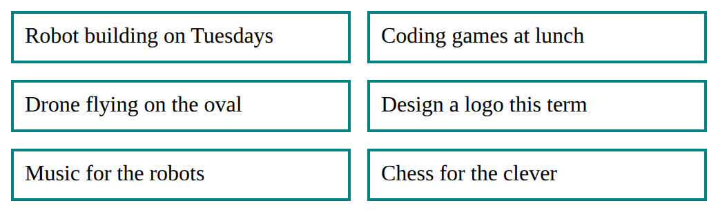
The cards wrap, but they touch.
<style>
  .gallery {
    display: flex;
    flex-wrap: wrap;
  }
  .item {
    flex: 1;
    min-width: 140px;
    border: 2px solid teal;
    padding: 8px;
  }
</style>
<div class="gallery">
  <div class="item"><p>Robots</p></div>
  <div class="item"><p>Coding</p></div>
  <div class="item"><p>Drones</p></div>
  <div class="item"><p>Design</p></div>
</div>
Make
Make a gallery for a school event: a heading and at least six pictures, each with good alt text. It should fit a phone and a laptop: the pictures wrap onto new lines and share the room on each line. Pictures you can use: trophy.svg, medal.svg, book.svg, ball.svg, star.svg, music.svg.
Need a hint?
A gallery is a box that holds the items, and each picture is inside an item. The row rules go on the gallery.
Another hint
Start with a <div class="gallery"> holding at least six <div class="item"> boxes, each with an img (and its alt).
Another hint
Then .gallery with display: flex;, flex-wrap: wrap; and a gap, and .item with flex: 1; and a min-width.
Show the expected result

Make a gallery of at least six pictures that wraps, with items that share the space and have a minimum width.
This ticks when your page has all of the above.
For teachers
Students let a flex row wrap with flex-wrap, share each line with flex: 1 and set a min-width, and find out that a fixed width does not change with the screen. About 40 minutes.
Open the teacher guide: answers, solutions, slides and a worksheet.
Students will be able to
- I can use flex-wrap: wrap so a row drops items onto new lines.
- I can use flex: 1 and min-width so items share the room and do not get squashed.
- I can explain why a fixed width does not fit every screen.
Before class
Do the Make task yourself in the playground (about 5 minutes).
A flex row keeps all its items in one line unless it is told it may wrap. flex-wrap: wrap on the row allows new lines. flex: 1 on the items makes them share the spare room on their line. min-width is the narrowest an item may be: once a line cannot fit another item at that width, the item drops to the next line. Together they make a layout that fits a phone and a laptop with no separate versions.
The preview pane is narrow, so students do not need to resize the browser. They change the number of cards or the min-width and see the same effect a screen of a different width would give.
Running the lesson
- Predict and Run: most students expect the cards to drop down by themselves. They run off the right edge instead. Add the wrap line, then change min-width to see the number per line change.
- Investigate: the 450px question is arithmetic with the gap. Ask students to work it out before choosing. The fixed-width question separates 'looks right on my laptop' from 'is right everywhere'.
- Mix it up: the cards touch each other. The fix is the same one as last lesson, on the row.
- Modify and Make: if a gallery squashes, ask what the smallest card should be.
The hard part (on purpose)
Believing the browser moves items down by itself. Ask what the row has been told about wrapping before saying.
When students get stuck
- The cards run off the edge and do not wrap. Ask: Which rule has flex-wrap? Fix: Put flex-wrap wrap in the rule of the box that holds the cards, the same rule as display flex.
- The cards are thin, with words broken into pieces. Ask: What stops a card getting narrower? Fix: Add a min-width to the card rule. A card that would be narrower drops to the next line.
- One card stretches across a whole line by itself. Ask: How many cards are on that line? Fix: With flex 1 a lone card on a line grows to fill it. That is expected. A smaller min-width puts more cards on each line.
Stretch and support
Stretch: Give the gallery a width of 300px, then 600px, and write down how many cards fit on a line each time. Explain the numbers with min-width and gap.
Support: Give students the Run page and ask them only to add the wrap line and to change the number of cards. Tell them what each change does to the cards on a line.
Where it leads
Next lesson uses a wrapping row for a hero and a row of cards, and shows that one rule can style any number of copies. Class idea: open a school website and drag the window narrower; ask which parts wrap.
What each step is for
- Predict: Students expect items to move down by themselves when a row is full; without flex-wrap they stay in one line.
- Run: flex-wrap: wrap moves items to a new line when the row is full, flex: 1 shares the space on each line, and min-width sets how narrow an item may get.
- Investigate: A fixed width is the same on every screen. A wrapping row with flex: 1 and a min-width changes how many items fit on a line.
- Modify: A min-width keeps wrapped cards from being squashed, and a bigger min-width puts fewer cards on each line.
- Mix it up: The wrapped cards need the space between them set on the row with gap, the same as a row that does not wrap.
- Use flex-wrap: wrap so a row drops items onto new lines.
- Use flex: 1 and min-width so items share the room and do not get squashed.
- Explain why a fixed width does not fit every screen.