Challenge: lay out the club page
Lay out the Course A club page in three milestones, from a header with the menu on the right to a hero, a row of cards, a table, a sign-up card and a footer, then make it your own.
Take a page that only runs down the screen and give it a layout: a menu on the right, cards in a row, a sign-up card.
In Course A you built a club page that runs down the screen in order. Now lay it out. Everything you need, you have met before. Check the page after every change.
- Investigate: Trace how each line of code connects to what you see.
- Modify: Change the code on purpose and check the result.
- Make: Build something new using what you have learned. Expect a few tries; that is normal.
Make your prediction first. Help opens once you've locked it in.
Plan the layout
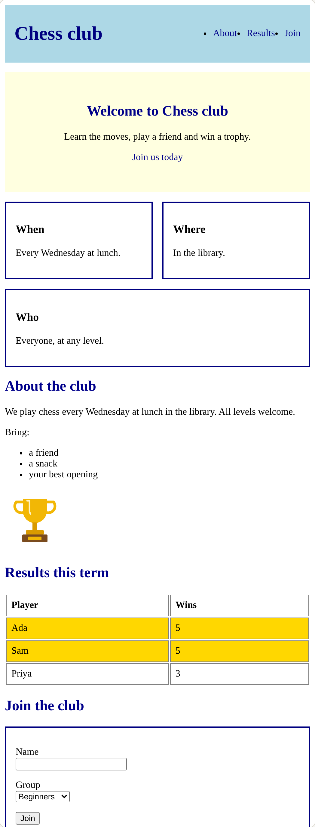
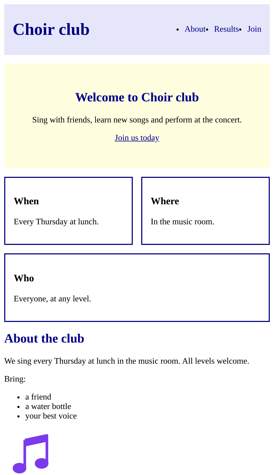
The picture shows the page you will build.
<style>
  header {
    background-color: lightblue;
    padding: 8px 16px;
    display: flex;
    justify-content: space-between;
    align-items: center;
  }
  nav ul {
    display: flex;
    gap: 16px;
    margin: 0;
    padding: 0;
  }
  nav a {
    text-decoration: none;
  }
  h1 {
    color: navy;
  }
  a {
    color: darkblue;
  }
  h2 {
    color: darkblue;
  }
  .winner {
    background-color: gold;
  }
  footer {
    background-color: lightblue;
    text-align: center;
    padding: 16px;
  }
  .hero {
    background-color: lightyellow;
    text-align: center;
    padding: 32px;
    margin: 16px 0;
  }
  .cards {
    display: flex;
    flex-wrap: wrap;
    gap: 16px;
  }
  .card {
    flex: 1;
    min-width: 200px;
    padding: 16px;
    border: 2px solid navy;
  }
  table {
    width: 100%;
  }
  td, th {
    padding: 8px;
    border: 1px solid gray;
    text-align: left;
  }
  label {
    display: block;
  }
</style>
<header>
  <h1>Chess club</h1>
  <nav>
    <ul>
      <li><a href="#about">About</a></li>
      <li><a href="#results">Results</a></li>
      <li><a href="#join">Join</a></li>
    </ul>
  </nav>
</header>
<main>
  <section class="hero">
    <h2>Welcome to Chess club</h2>
    <p>Learn the moves, play a friend and win a trophy.</p>
    <p><a href="#join">Join us today</a></p>
  </section>
  <section class="cards">
    <div class="card">
      <h3>When</h3>
      <p>Every Wednesday at lunch.</p>
    </div>
    <div class="card">
      <h3>Where</h3>
      <p>In the library.</p>
    </div>
    <div class="card">
      <h3>Who</h3>
      <p>Everyone, at any level.</p>
    </div>
  </section>
  <section id="about">
    <h2>About the club</h2>
    <p>We play chess every Wednesday at lunch in the library. All levels welcome.</p>
    <p>Bring:</p>
    <ul>
      <li>a friend</li>
      <li>a snack</li>
      <li>your best opening</li>
    </ul>
    <img src="trophy.svg" alt="A gold trophy" width="100">
  </section>
  <section id="results">
    <h2>Results this term</h2>
    <table>
      <tr><th>Player</th><th>Wins</th></tr>
      <tr class="winner"><td>Ada</td><td>5</td></tr>
      <tr class="winner"><td>Sam</td><td>5</td></tr>
      <tr><td>Priya</td><td>3</td></tr>
    </table>
  </section>
  <section id="join">
    <h2>Join the club</h2>
    <form class="card">
      <p><label for="name">Name</label>
      <input id="name" type="text"></p>
      <p><label for="group">Group</label>
      <select id="group">
        <option>Beginners</option>
        <option>Players</option>
        <option>Champions</option>
      </select></p>
      <button>Join</button>
    </form>
  </section>
</main>
<footer>
  <p>Contact: chess@example.com</p>
</footer>
Which rule makes each part?
How much CSS does a fourth card need?
Match each part of the laid-out page with the rule that makes it.
Build the layout
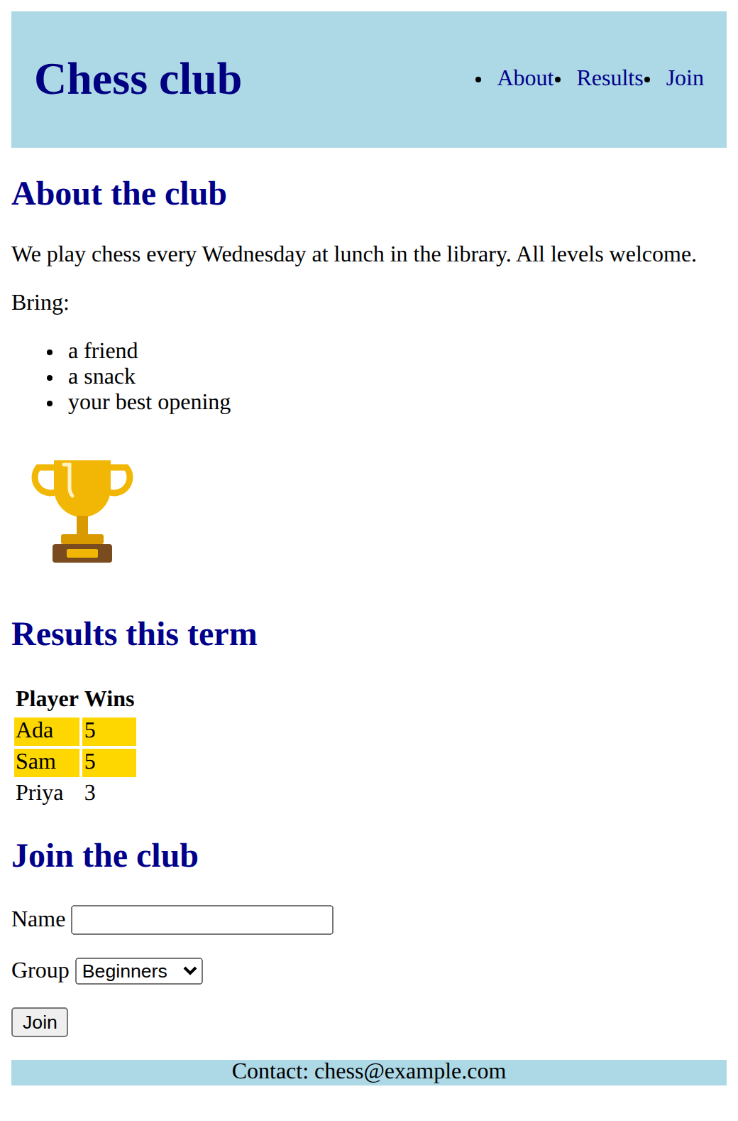
The name and the menu sit one above the other. Put them on one line. Replace the header rule with this one, and add the two rules below it:
<style>
  header {
    background-color: lightblue;
    padding: 8px 16px;
    display: flex;
    justify-content: space-between;
    align-items: center;
  }
  nav ul {
    display: flex;
    gap: 16px;
    margin: 0;
    padding: 0;
  }
  nav a {
    text-decoration: none;
  }
</style>
The header holds the name and the menu, so the header is the flex box. The menu list holds the links, so nav ul is a flex box too. nav a styles only the links inside the menu.
Need a hint?
Replace the header rule with the one in the lesson, then add the nav ul and nav a rules below it.
Another hint
display: flex goes on the box that holds the items: the header holds the name and the menu, and the ul holds the links.
Another hint
justify-content: space-between pushes the name left and the menu right.
Show the expected result
Follow the comments. Build:
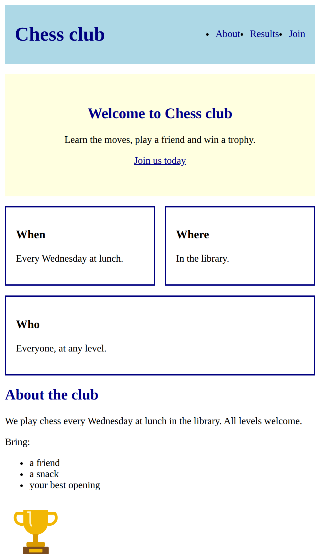
- a hero: a
<section class="hero">with an<h2>, a paragraph and a link to#join, styled by a.herorule; - a
<section class="cards">holding three<div class="card">, each with an<h3>and a paragraph; - a
.cardsrule that makes a row that wraps, with a gap; - one
.cardrule for all three cards, so they share the row and do not squash.
Need a hint?
Follow the outline in the comments: each comment becomes one piece of HTML or one rule.
Another hint
The cards row is a <section class="cards"> that holds three <div class="card">. Put display: flex, flex-wrap: wrap and gap on .cards.
Another hint
Put flex: 1 and min-width: 200px on .card, with padding and a border. Adding a fourth card needs no new CSS.
Show the expected result
Goals only this time:
- the results table has padding and a border on its cells;
- the sign-up form is a card, with each label on its own line;
- the footer has padding.
Need a hint?
The goals list three parts: the table, the sign-up form and the footer. Do one at a time and check the page after each.
Another hint
The form is a card: reuse the class you already have, <form class="card">. No new rule is needed for that.
Another hint
Labels are inline, so they sit beside their box. display: block on label gives each its own line.
Show the expected result
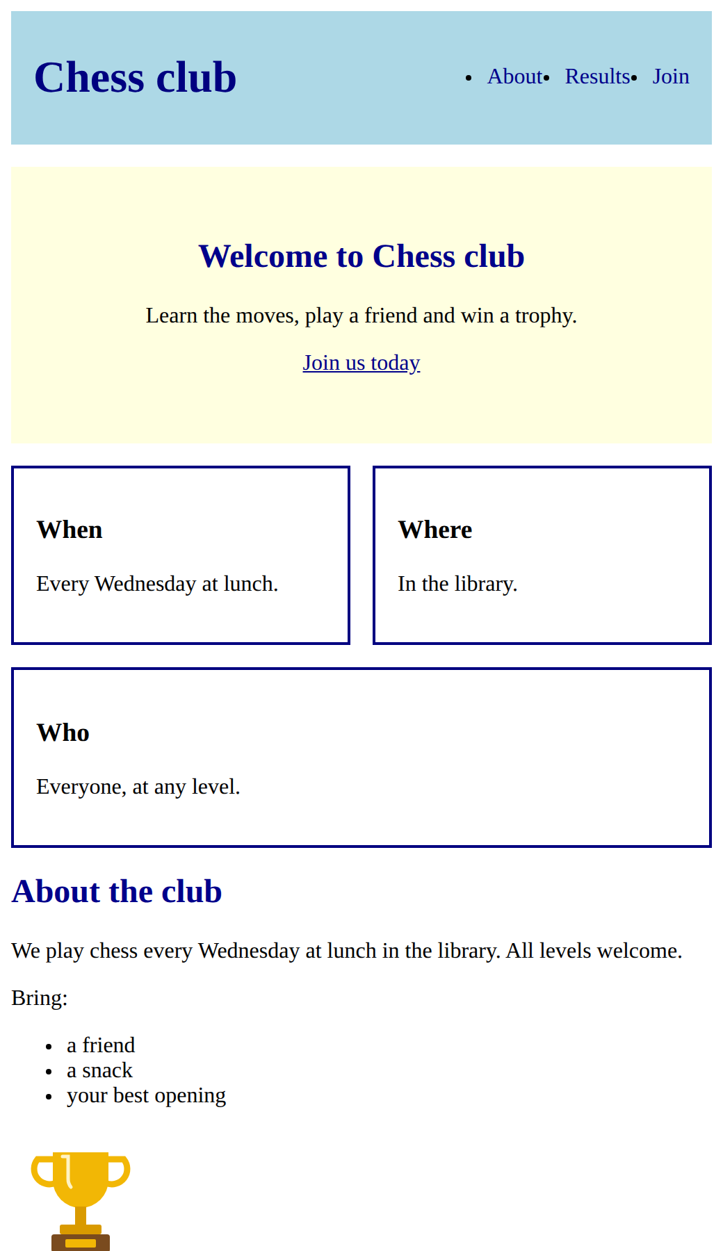
Raise the cards' min-width (try 300px). The cards should drop onto new lines and none should squash. Then click every menu link and every label.
Put the club name on the left and the menu in a row on the right, and style the links with nav a.
This ticks when your page has all of the above.
Add a hero and three cards in a row that wraps, with one class for the cards.
This ticks when your page has all of the above.
Style the table cells, make the sign-up form a card with each label on its own line, and pad the footer.
This ticks when your page has all of the above.
Make it yours
Turn the page into one for a club or event you care about: a new name, your own words, your own colours. Add a fourth card by copying one. Try justify-content: center on the cards, or a different gap. Then check the narrow view again.
Need a hint?
Change one thing at a time: the club name, then the words, then the colours.
Another hint
Pictures you can use: trophy.svg, medal.svg, book.svg, ball.svg, star.svg, music.svg.
Show the expected result
For teachers
Students lay out the Course A club page in three milestones with fading support (header and menu, then a hero and a wrapping row of cards, then the table, a sign-up card and the footer), then make it their own. About 90 minutes.
Open the teacher guide: answers, solutions, slides and a worksheet.
Students will be able to
- I can plan a layout as a list of parts.
- I can put a name and a menu on one line with Flexbox, and style the menu links with nav a.
- I can build a hero and a row of cards that wraps, sharing one class.
- I can lay out a table, a form card and a footer.
Before class
Read the challenge primer "Running the final challenge", then build milestone 1 yourself and plan milestones 2 and 3 on paper.
There is nothing new in this lesson. The starter is the finished Course A club page, so students who skipped Course A can still start here. Every milestone recalls earlier lessons: rules that combine and nav a, block and inline, the box, Flexbox rows, gap, justify-content, wrapping and components. Support fades on purpose: milestone 1 gives the exact code, milestone 2 an outline in comments, milestone 3 only the goals. There is no separate review step, because the whole lesson is review. Finishing this lesson marks Challenge complete on the course page.
Running the lesson
- Plan the layout: match each part to its rule. Write the parts on the board as a checklist.
- Milestone 1: everyone should finish this in the first lesson. Ask where display: flex goes, and why there are two flex boxes.
- Milestone 2: the outline is in the comments. Students who are stuck can use **Reset to this task's start** to load a working milestone 1.
- Milestone 3: goals only. Ask students to name which earlier rule each goal reuses before typing.
- Make it yours: any club or event. Ask for a fourth card made by copying, with no new CSS.
The hard part (on purpose)
Planning a whole layout from parts they already know, and putting display flex on the right box. Have them name the box that holds the items first.
When students get stuck
- Nothing moved in the header. Ask: Which box holds the name and the menu, and does it have display flex? Fix: Put display flex on the header, the box that holds them, not on the h1 or the nav.
- The menu links are still stacked in a column. Ask: Which box holds the links? Fix: Put display flex on nav ul, the list that holds the li items.
- The cards stay in one row and squash when they have no min-width. Ask: Does the row have flex-wrap wrap, and does the card have a min-width? Fix: Add flex-wrap wrap to .cards, and flex 1 with min-width 200px to .card.
- The labels still sit beside their boxes. Ask: Are labels block or inline? Fix: Labels are inline. Add label { display: block; }.
Stretch and support
Stretch: Add a fourth card, then a second row of cards. Try justify-content: center on the cards and see what changes. Try the optional lessons on Grid and on making the page react.
Support: Let students use Reset to this task's start at each milestone, so everyone reaches milestone 3. Pair students for milestone 3: one does the table, one the form.
Where it leads
The finished page is a portfolio piece: students can name each part and the lesson it came from. Optional lessons follow: Grid for whole-page layouts, and Make it react for a first look at JavaScript.
What each step is for
- Plan the layout: Seeing the laid-out page as named parts turns a big task into a list of small ones students have already done.
- Build the layout: Three milestones with fading support: the full code, then an outline, then only the goals.
- Plan a layout as a list of parts.
- Put a name and a menu on one line with Flexbox, and style the menu links with nav a.
- Build a hero and a row of cards that wraps, sharing one class.
- Lay out a table, a form card and a footer.