Boxes
See every element as a box with padding, a border and a margin, and find out that width sets only the content.
Cards, buttons, menus and photos on every website are boxes, sized and spaced with the same few parts.
Every element on a page is a box, and CSS sets how much room each box has inside it and around it.
- Predict: Read the code and say what it will do before you run anything. A wrong guess is fine: it shows you what to look for.
- Run: Run it and compare the result with your prediction.
- Investigate: Trace how each line of code connects to what you see.
- Modify: Change the code on purpose and check the result.
- Make: Build something new using what you have learned. Expect a few tries; that is normal.
Make your prediction first. Help opens once you've locked it in.
Predict
<style>
  .card {
    width: 200px;
    padding: 20px;
    border: 5px solid navy;
  }
</style>
<div class="card">Owls: 12 points</div>
width sets how wide a box is, padding adds space inside its border, and border draws the line. Read the code. How wide is the whole card?
How wide is the card on the page, from the outside of its border on the left to the outside on the right, in pixels?
Run
The Box model view is on: point at the card. Blue is the content, green the padding, gold the border, and the label shows the sizes. Compare the width with your prediction. Then change padding to 40px and point at it again, and add margin: 20px; to see the orange margin.
| Code | What it does | Why |
|---|---|---|
width: 200px; |
Sets how wide the content is | It sets only the words' area. Padding and border are added outside it, on both sides, so the card is wider than 200 |
padding: 20px; |
Adds room inside the border, around the content | It is part of the box, so the background colour fills it. 20 on each side adds 40 |
border: 5px solid navy; |
Draws a line around the padding | Thickness, style and colour in one line. 5 on each side adds 10 |
margin: 20px; |
Adds space outside the border, between boxes | It is outside the box, so it is not part of the card's width and has no background |
20px with its px |
Every size needs a unit | Without one, such as padding: 20;, the browser ignores the line and shows no error |
<style>
  .card {
    width: 200px;
    padding: 20px;
    border: 5px solid navy;
  }
</style>
<div class="card">Owls: 12 points</div>
Investigate
The picture shows the first card in the Box model view: orange margin, gold border, green padding, blue content.
<style>
  .card {
    width: 180px;
    padding: 15px;
    border: 4px solid teal;
    margin: 16px;
    background-color: lightyellow;
  }
</style>
<div class="card">Owls: 12 points</div>
<div class="card">Hawks: 9 points</div>
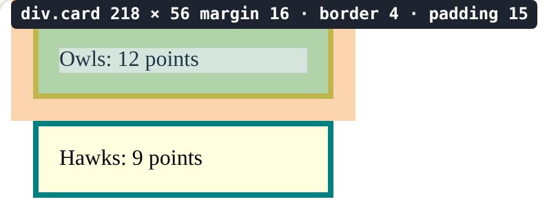
The first card's rule is width: 180px; padding: 15px; border: 4px solid teal; margin: 16px;.
The words are squashed against the border.

This card should have room inside its border.
In the picture, how wide is the first card on the page, outside border to outside border, in pixels?
The border shows, but the words are squashed against it: the padding does nothing, and there is no error. Click the line that causes it.
Modify
Give the cards 12px of padding.
Need a hint?
Add padding: 12px; inside the .card rule.
Show the expected result

Space the cards apart with 16px of margin.
Need a hint?
Margin is outside the border: margin: 16px;
Show the expected result

Make each card's content 200px wide. How wide is each card now? Point at it to check.
Need a hint?
width: 200px; Remember that padding and border are added to it.
Show the expected result

Give the cards 12px of padding.
This ticks when your page has all of the above.
Space the cards apart with 16px of margin.
This ticks when your page has all of the above.
Make each card's content 200px wide.
This ticks when your page has all of the above.
Mix it up
Both tags are span elements in one line of text.
<style>
  .tag {
    width: 120px;
    padding: 8px;
    border: 2px solid teal;
  }
</style>
<p>Today: <span class="tag">Owls</span> <span class="tag">Hawks</span></p>
Make
Make a card for a house or a club: a <div> with a heading, a picture and a line of text, styled with padding, a border, margin and a width. Point at it with Box model and work out its width before you check.
Need a hint?
A card is one box that holds the heading, the picture and the line of text. Build the box first, then style it.
Another hint
Start with a <div class="card"> holding an <h2>, an <img> and a <p>.
Another hint
Then a <style> block with a .card rule: padding, border, margin and width.
Show the expected result
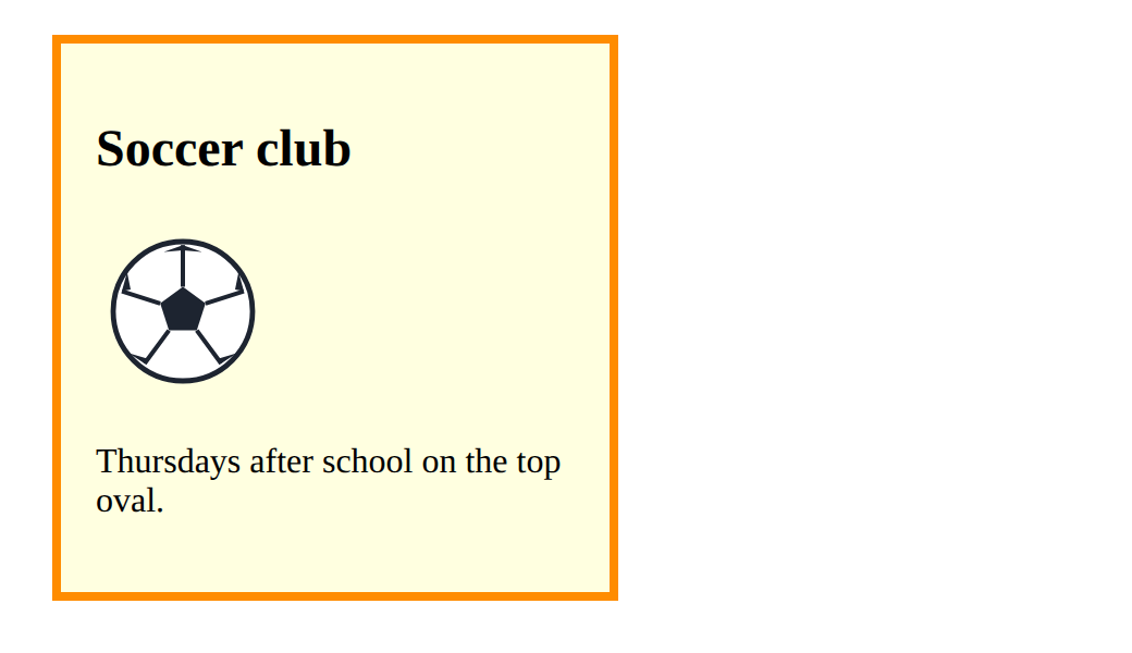
Make a card with a heading and a picture, styled with padding, a border and a width.
This ticks when your page has all of the above.
For teachers
Students see every element as a box of content, padding, border and margin, and find out that width sets only the content, so padding and border make the box wider. About 45 minutes.
Open the teacher guide: answers, solutions, slides and a worksheet.
Students will be able to
- I can name the four parts of a box: content, padding, border and margin.
- I can work out how wide a box is from its width, padding and border.
- I can use padding and margin to space boxes inside and out.
- I can explain why a value without a unit does nothing.
Before class
Read the unit primer "CSS in 5 minutes" (the box paragraph), then make the Make task's card yourself and point at it with Box model on.
The Box model view (a button in the HTML playground) works like the browser's developer tools: point at any box to see its margin (orange), border (gold), padding (green) and content (blue), with sizes. It never changes the page. The Boxes button is different: it adds space to show nesting, so use Box model in this lesson.
The one idea: width sets the content only. The box on the page is the width plus the padding and border on both sides. Real sites often set box-sizing: border-box so that width includes padding and border; mention it once, after students are comfortable with the sums.
Running the lesson
- Predict: almost everyone says 200. The card is 250 wide: padding and border are added to the width on both sides. Let students check with Box model. Most will say 200. Ask what the 20 and the 5 in the rule are for, then let them point at the card with Box model.
- Run: change the padding and point again. Ask: which number in the label changed, and which part of the card grew?
- Investigate: the number task is the sum on paper (180 + 30 + 8). The wrong answers are the real slips: content only, one side only, margin included. The last task is `padding: 20` with no unit; the browser ignores it without an error.
- Mix it up: padding works on an inline span but width does not. Ask who remembers what block and inline meant.
- Modify: build the card one property at a time, checking each with Box model, and work out the width before pointing.
The hard part (on purpose)
Working out that padding and border add to the width. Ask for the sum on paper first (200 + 20 + 20 + 5 + 5), then check it with Box model.
When students get stuck
- Padding or margin does nothing, and there is no error. Ask: Does the value have a unit, such as px? Fix: Write padding: 20px; not padding: 20;
- The card is wider than the width they set. Ask: What else is added to the width? Fix: Padding and border are added on both sides; take them into account, or reduce the width.
- The cards touch each other. Ask: Which property makes space outside a box? Fix: Add margin to the card's rule (padding is inside the border).
Stretch and support
Stretch: Use different padding on each side (padding: 10px 30px;) and predict the width before pointing at it. Then add border-radius: 12px; for rounded corners.
Support: Give students the Modify starter with Box model on and ask them only to add padding, then margin, pointing at the card after each.
Where it leads
Next lesson is a review of the unit on a whole newsletter page: reading a longer stylesheet and turning the articles into cards. Class idea: measure a real website's buttons with the browser's developer tools (right-click, Inspect).
What each step is for
- Predict: Most students say 200; the card is 250 because padding and border are added to the width on both sides.
- Run: The Box model view measures each part: content, padding, border and margin.
- Investigate: The width is only the content: padding and border add to it on both sides, and margin is outside it.
- Modify: Building a card one property at a time, checking each change with the Box model view.
- Mix it up: A span is inline, so its width is ignored until display: block makes it a block box.
- Name the four parts of a box: content, padding, border and margin.
- Work out how wide a box is from its width, padding and border.
- Use padding and margin to space boxes inside and out.
- Explain why a value without a unit does nothing.