<h2> subheading
A smaller heading for a section.
<h2>Subheading</h2>Example
<h1>Robotics Club</h1>
<h2>This term</h2>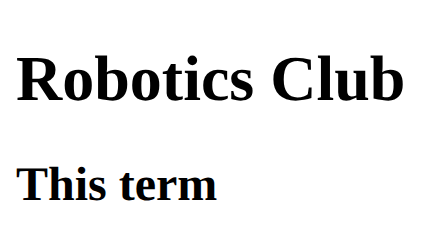
Layout and components · In any playground, open Reference to copy these.
A smaller heading for a section.
<h2>Subheading</h2><h1>Robotics Club</h1>
<h2>This term</h2>A link. The address goes in href; the words between the tags are what people click.
<a href="https://example.com">Link text</a><p>Read the <a href="https://example.com">club rules</a>.</p>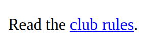
The top part of a page: usually the title and the menu. Looks like a div; the name tells browsers and screen readers what it is.
<header>
  <h1>Site name</h1>
</header><header>
<h1>Chess club</h1>
</header>
<p>Page content</p>
The bottom part of a page: contact details, small print.
<footer>
  Contact and small print
</footer><p>Page content</p>
<footer>
<p>Contact: chess@example.com</p>
</footer>
Where CSS lives. Each rule is: selector { property: value; }
<style>
  h1 {
    color: red;
  }
</style><style>
h2 {
color: purple;
}
</style>
<h2>Purple heading</h2>
<p>Normal text</p>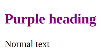
Style every element matching the selector.
p {
  color: blue;
}<style>
li {
color: teal;
}
</style>
<ul>
<li>One</li>
<li>Two</li>
</ul>
One rule for several kinds of element: list the selectors with commas.
h1, h2 {
  color: navy;
}<style>
h1, li {
color: purple;
}
</style>
<h1>Title</h1>
<ul>
<li>An item</li>
</ul>
<p>A paragraph</p>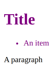
The background colour.
background-color: lightyellow;<style>
h2 {
background-color: lightyellow;
}
</style>
<h2>Notice</h2>
Style only the links inside the nav. The space means inside: nav a is every a within a nav.
nav a {
  color: white;
  text-decoration: none;
}<style>
nav a {
color: crimson;
text-decoration: none;
}
</style>
<nav>
<ul>
<li><a href="https://example.com">Home</a></li>
<li><a href="https://example.com/rules">Rules</a></li>
</ul>
</nav>
<p>A <a href="https://example.com">link in the text</a> keeps its look.</p>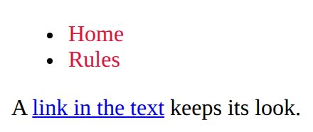
A row of items. gap is the space between them, justify-content places them along the row, align-items lines them up across it.
.row {
  display: flex;
  gap: 16px;
  justify-content: space-between;
  align-items: center;
}<style>
.bar {
display: flex;
gap: 16px;
justify-content: space-between;
align-items: center;
}
</style>
<section class="bar">
<h2>Chess club</h2>
<p>Join us</p>
</section>
A chunk of HTML with a class. Copy the section for each card; one rule styles every copy.
<style>
  .card {
    padding: 16px;
    border: 1px solid gray;
  }
</style>
<section class="card">
  <h2>Title</h2>
  <p>Some text.</p>
</section><style>
.card {
padding: 16px;
border: 1px solid gray;
}
</style>
<section class="card">
<h2>Chess</h2>
<p>Wednesdays.</p>
</section>
<section class="card">
<h2>Art</h2>
<p>Thursdays.</p>
</section>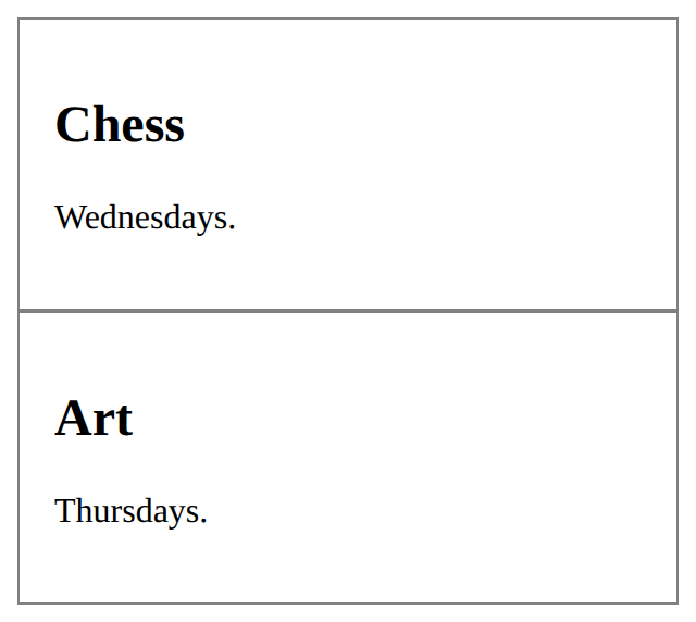
A paragraph of text.
<p>Some text</p><p>We meet on Tuesdays.</p>
<p>Everyone is welcome.</p>
A bulleted list. Each item is an <li>.
<ul>
  <li>First</li>
  <li>Second</li>
</ul><ul>
<li>Apples</li>
<li>Pears</li>
<li>Plums</li>
</ul>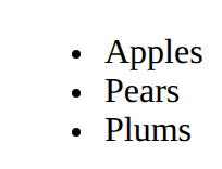
The main menu of links.
<nav>
  <a href="#">Home</a>
</nav><nav>
<a href="#">Home</a>
<a href="#">Games</a>
</nav>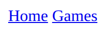
The parts of a page, named: header, nav, main with its sections, and footer. They look like plain blocks; the names are for screen readers and search engines.
<header>
  <h1>Site name</h1>
  <nav>
    <ul>
      <li><a href="https://example.com">Home</a></li>
    </ul>
  </nav>
</header>
<main>
  <section>
    <h2>Section title</h2>
    <p>Some text.</p>
  </section>
</main>
<footer>
  <p>Contact us</p>
</footer><header>
<h1>Chess club</h1>
<nav>
<ul>
<li><a href="https://example.com">Home</a></li>
<li><a href="https://example.com/rules">Rules</a></li>
</ul>
</nav>
</header>
<main>
<section>
<h2>When we meet</h2>
<p>Wednesdays at lunch.</p>
</section>
</main>
<footer>
<p>Contact the teacher in charge.</p>
</footer>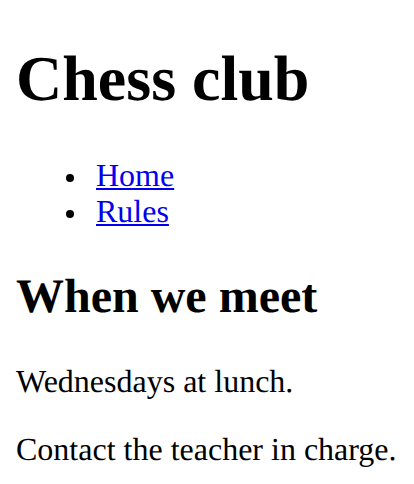
Style only the elements you mark with class="note" in the HTML. The dot is only in the CSS.
.note {
  color: red;
}<style>
.tip {
font-style: italic;
}
</style>
<p>A normal paragraph.</p>
<p class="tip">A paragraph with class="tip".</p>
The text colour.
color: red;<style>
em {
color: crimson;
}
</style>
<p>A <em>red</em> word</p>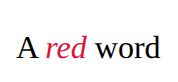
How big the text is.
font-size: 20px;<style>
h2 {
font-size: 40px;
}
</style>
<h2>Big</h2>
<p>Normal</p>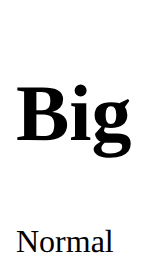
A box with room inside (padding), a line around it (border) and space outside it (margin). Width sets the content only.
.card {
  width: 200px;
  padding: 16px;
  border: 2px solid navy;
  margin: 12px;
}<style>
.card {
width: 200px;
padding: 16px;
border: 2px solid navy;
margin: 12px;
}
</style>
<section class="card">
<h2>Chess</h2>
<p>Wednesdays at lunch.</p>
</section>
A row that moves items to a new line when there is no room. flex: 1 lets items share the space and min-width stops them getting too narrow.
.gallery {
  display: flex;
  flex-wrap: wrap;
  gap: 12px;
}
.item {
  flex: 1;
  min-width: 150px;
}<style>
.gallery {
display: flex;
flex-wrap: wrap;
gap: 12px;
}
.item {
flex: 1;
min-width: 150px;
background-color: lightyellow;
}
</style>
<section class="gallery">
<p class="item">One</p>
<p class="item">Two</p>
<p class="item">Three</p>
<p class="item">Four</p>
</section>
Headings are the page's outline: one h1, then h2 for each part, h3 inside those. Never pick a level for its size; set the size with CSS.
<h1>Page title</h1>
<h2>A part of the page</h2>
<h3>A part of that part</h3>