Navbar, cards and a grid
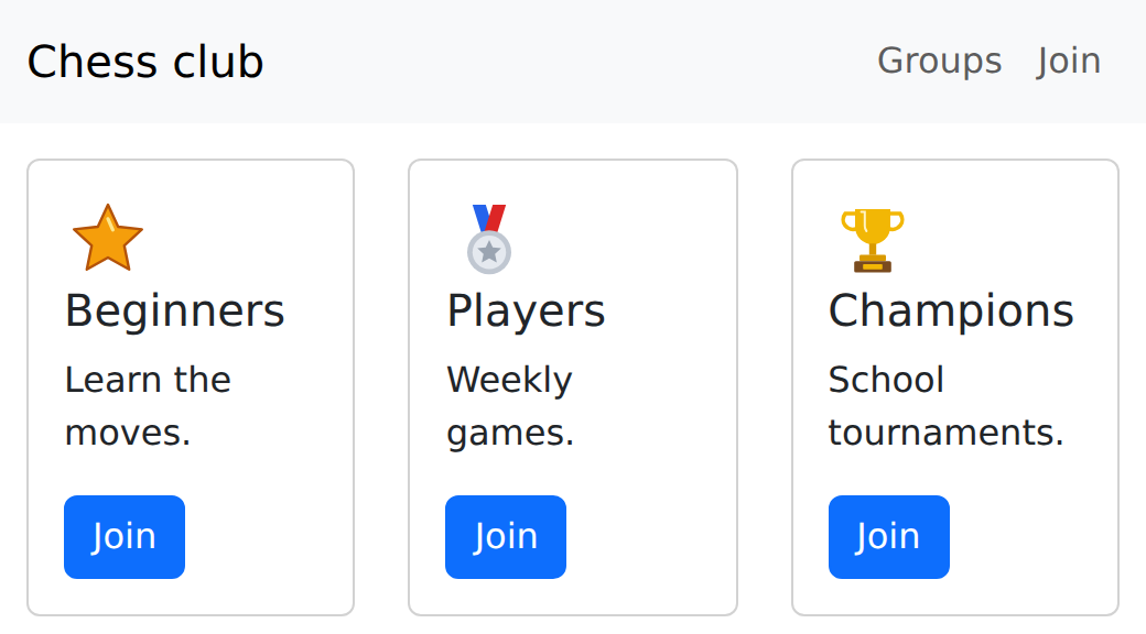
Rebuild the club page's menu, cards and form with Bootstrap: each part is a fixed shape of nested tags with class names, and the grid's row and col line the cards up.
A navbar, a row of cards and a sign-up form: most websites you visit are built from these same few parts.
In the club page you built the menu, the cards and the form from tags and your own CSS. Bootstrap has each of them ready-made. A Bootstrap part is a shape: tags nested in a fixed way, each with its class name. Copy the shape, then change the words.
The cards sit in Bootstrap's grid: a row holds cols, and the cols share the row's width.
- Predict: Read the code and say what it will do before you run anything. A wrong guess is fine: it shows you what to look for.
- Run: Run it and compare the result with your prediction.
- Investigate: Trace how each line of code connects to what you see.
- Modify: Change the code on purpose and check the result.
- Make: Build something new using what you have learned. Expect a few tries; that is normal.
Make your prediction first. Help opens once you've locked it in.
Predict
<link rel="stylesheet" href="bootstrap.min.css">

<div class="container mt-3">
  <div class="row">
    <div class="col">
      <div class="card"><div class="card-body">Beginners</div></div>
    </div>
    <div class="col">
      <div class="card"><div class="card-body">Players</div></div>
    </div>
    <div class="col">
      <div class="card"><div class="card-body">Champions</div></div>
    </div>
  </div>
</div>
row and col are new. Each card sits inside a col, and the cols sit inside a row.
Run
Compare with your prediction. Switch on Boxes to see the shapes nest. Then delete one whole col (from <div class="col"> to its closing </div>) and watch the other two share the row.
<link rel="stylesheet" href="bootstrap.min.css">

<nav class="navbar navbar-expand bg-body-tertiary">
  <div class="container">
    <a class="navbar-brand" href="#">Chess club</a>
    <ul class="navbar-nav">
      <li class="nav-item"><a class="nav-link" href="#groups">Groups</a></li>
      <li class="nav-item"><a class="nav-link" href="#join">Join</a></li>
    </ul>
  </div>
</nav>

<div class="container mt-3" id="groups">
  <div class="row">
    <div class="col">
      <div class="card">
        <div class="card-body">
          <img src="star.svg" alt="A star" width="40">
          <h5 class="card-title">Beginners</h5>
          <p class="card-text">Learn the moves.</p>
        </div>
      </div>
    </div>
    <div class="col">
      <div class="card">
        <div class="card-body">
          <img src="medal.svg" alt="A medal" width="40">
          <h5 class="card-title">Players</h5>
          <p class="card-text">Weekly games.</p>
        </div>
      </div>
    </div>
    <div class="col">
      <div class="card">
        <div class="card-body">
          <img src="trophy.svg" alt="A trophy" width="40">
          <h5 class="card-title">Champions</h5>
          <p class="card-text">School tournaments.</p>
        </div>
      </div>
    </div>
  </div>
</div>
Investigate
<link rel="stylesheet" href="bootstrap.min.css">

<nav class="navbar navbar-expand bg-body-tertiary">
  <div class="container">
    <a class="navbar-brand" href="#">Chess club</a>
    <ul class="navbar-nav">
      <li class="nav-item"><a class="nav-link" href="#groups">Groups</a></li>
      <li class="nav-item"><a class="nav-link" href="#join">Join</a></li>
    </ul>
  </div>
</nav>

<div class="container mt-3" id="groups">
  <div class="row">
    <div class="col">
      <div class="card">
        <div class="card-body">
          <img src="star.svg" alt="A star" width="40">
          <h5 class="card-title">Beginners</h5>
          <p class="card-text">Learn the moves.</p>
        </div>
      </div>
    </div>
    <div class="col">
      <div class="card">
        <div class="card-body">
          <img src="medal.svg" alt="A medal" width="40">
          <h5 class="card-title">Players</h5>
          <p class="card-text">Weekly games.</p>
        </div>
      </div>
    </div>
    <div class="col">
      <div class="card">
        <div class="card-body">
          <img src="trophy.svg" alt="A trophy" width="40">
          <h5 class="card-title">Champions</h5>
          <p class="card-text">School tournaments.</p>
        </div>
      </div>
    </div>
  </div>
</div>

Each class has a job.
Compare with your club page.
One card is too wide.
Match each class with its job in the shape.
Your hand-built club page needed about 40 lines of CSS for its header, menu and cards. How many lines of CSS of its own does this page have?
Beginners fills the whole width, and the other two cards sit on a line underneath. There is no error. Click the line that is wrong.
Modify
Inside the card's body.
Need a hint?
A button in a card goes inside its card-body, after the text.
Another hint
A link can look like a button: a class="btn btn-primary" with href="#join". Put one in each card-body.
Show the expected result
Labels and boxes with Bootstrap's form classes.
Need a hint?
Bootstrap styles a form when each part has its class: form-label, form-control, form-select.
Another hint
Add a container with id="join" under the cards: a heading, a label and box for the name, a select for the group, and a button. Look up form-control on the Reference cards.
Show the expected result

Put a Join button in each card.
This ticks when your page has all of the above.
Add a sign-up form under the cards, with Bootstrap's form classes.
This ticks when your page has all of the above.
Results and a footer
Finish the club page: a results table styled by Bootstrap (look up its class on the Reference cards) and a footer with your club's contact details, using a spacing class and a background colour class.
Add a Bootstrap table of results and a footer.
This ticks when your page has all of the above.
Where this leads
Next: make Bootstrap look like yours, and compare it with the page you built by hand.
For teachers
Students rebuild the club page's navbar and cards with Bootstrap, predict how the grid places three cols, count the CSS the page no longer needs, find a made-up class name, add buttons and a sign-up form, and finish with a table and footer. About 55 minutes.
Open the teacher guide: answers, solutions, slides and a worksheet.
Students will be able to
- I can build a navbar, cards and a form by copying Bootstrap's shapes.
- I can line cards up with Bootstrap's row and col.
- I can look up a Bootstrap part I have not used before and fit it into my page.
Before class
Read the unit primer first. Each Bootstrap component is a shape: tags nested in a fixed order, each with its class (navbar > container > navbar-brand and navbar-nav; row > col > card > card-body). Students do not invent these; they copy the shape from the Reference card or getbootstrap.com and change the words. The grid: a row lines up its cols and shares the width equally (it is Flexbox inside, the same idea as their hand-built .cards { display: flex; }).
The navbar uses navbar-expand, so it never folds into a menu button: folding needs Bootstrap's JavaScript, which this course leaves out. The planted bug is a made-up class name (column): the browser ignores names it has no rule for, silently. This is the most common Bootstrap slip.
Running the lesson
- Predict: ask students to say what row and col might each do before running.
- Run: switch on Boxes and trace the nesting with a finger: row, col, card, card-body.
- Investigate: put a hand-built club page on the board for the count-the-CSS question.
- Modify: for the form, the Reference card has the shape; students add the classes to tags they already know.
- Make: the table class is new. Ask "where would you look it up?" rather than giving it.
The hard part (on purpose)
Students guess class names (column, blue, big-button) and expect them to work. Ask "is that name on the Reference card?" every time, rather than correcting it for them.
When students get stuck
- A card fills the whole width while the others share a line. Ask: Is its box's class exactly col? Fix: Use col, not column or cols; only Bootstrap's own names do anything.
- Cards stack one under another. Ask: Are the cols inside one row? Fix: Put every col straight inside the same div with class row.
- Text touches the card's border. Ask: Is there a card-body inside the card? Fix: Wrap the card's content in div class="card-body".
Stretch and support
Stretch: Give the cards different widths with col-8 and col-4 (a row is 12 parts), or add a badge to a card title. Try an image across the top of a card with card-img-top.
Support: Give students the card shape on paper with blanks for the class names.
Where it leads
Next lesson: your own CSS on top of Bootstrap, and when writing CSS by hand is the better choice. Class idea: hold up the hand-built club page and this one and ask which was quicker, and which is more theirs.
Sources
- Bootstrap 5.3: Grid system (checked 12 October 2026)
- Bootstrap 5.3: Navbar (checked 12 October 2026)
What each step is for
- Predict: The grid is the part a wrong guess is likely on; seeing equal columns appear from class names alone sets up the idea of copying a shape.
- Run: Each part is a shape of nested tags: navbar > container > brand and nav links; row > col > card > card-body.
- Investigate: Bootstrap's parts are fixed shapes with fixed names, and they replace the CSS students wrote by hand.
- Modify: Adding a part is copying its shape into the right place.
- results and a footer: Looking up a part students have not used before and fitting it into the page is the everyday Bootstrap skill.
- Build a navbar, cards and a form by copying Bootstrap's shapes.
- Line cards up with Bootstrap's row and col.
- Look up a Bootstrap part I have not used before and fit it into my page.