Bootstrap reference
Bootstrap's class names for buttons, the navbar, cards, the grid, forms and spacing, with what each one does.
Print a cheat sheet (the whole course or one unit, with a picture of what each command draws)
Bootstrap
<link rel="stylesheet" href="bootstrap.min.css">
Loads Bootstrap's stylesheet: a big CSS file someone else wrote. Put it first, above your own <style>. On your own site, download it from getbootstrap.com and put it beside your page.
id: bootstrap-link
<div class="container">
  content
</div>
A centred column with space at the sides. Most Bootstrap pages put everything inside one.
id: container
<button class="btn btn-primary">Join</button>
Example
<link rel="stylesheet" href="bootstrap.min.css">

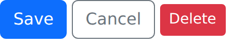
<button class="btn btn-primary">Save</button>
<button class="btn btn-outline-secondary">Cancel</button>
<button class="btn btn-danger btn-sm">Delete</button>
btn gives the button shape; a second class picks the colour: btn-primary, btn-secondary, btn-success, btn-danger, btn-warning, or btn-outline-primary for an outline. Add btn-lg or btn-sm for the size. It needs both btn and a colour.
id: btn-button
<div class="alert alert-warning">Message</div>
Example
<link rel="stylesheet" href="bootstrap.min.css">

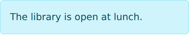
<div class="alert alert-info">The library is open at lunch.</div>
A coloured message box. alert gives the box; alert-primary, alert-success, alert-danger, alert-warning or alert-info picks the colour.
id: alert
<p class="mt-3 p-2 text-center">Text</p>
Example
<link rel="stylesheet" href="bootstrap.min.css">

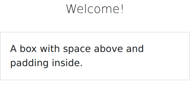
<p class="lead text-center">Welcome!</p>
<p class="mt-4 p-3 border">A box with space above and padding inside.</p>
m is margin and p is padding; then t, b, s, e (top, bottom, start, end), x (both sides) or y (top and bottom), then a size from 0 to 5: mt-3 is a space above. text-center centres text; lead makes a larger opening paragraph; fw-bold makes it bold.
id: spacing-and-text-classes
<nav class="navbar navbar-expand bg-body-tertiary">
  <div class="container">
    <a class="navbar-brand" href="#">Club name</a>
    <ul class="navbar-nav">
      <li class="nav-item"><a class="nav-link" href="#part">Link</a></li>
    </ul>
  </div>
</nav>
Example
<link rel="stylesheet" href="bootstrap.min.css">

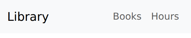
<nav class="navbar navbar-expand bg-body-tertiary">
  <div class="container">
    <a class="navbar-brand" href="#">Library</a>
    <ul class="navbar-nav">
      <li class="nav-item"><a class="nav-link" href="#">Books</a></li>
      <li class="nav-item"><a class="nav-link" href="#">Hours</a></li>
    </ul>
  </div>
</nav>
The bar across the top: the brand (your name) on the left, then the menu. navbar-expand keeps the menu in a row (folding it into a button on phones needs Bootstrap's JavaScript).
id: navbar
<div class="card">
  <div class="card-body">
    <h5 class="card-title">Title</h5>
    <p class="card-text">Text</p>
  </div>
</div>
Example
<link rel="stylesheet" href="bootstrap.min.css">

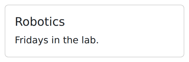
<div class="card m-2">
  <div class="card-body">
    <h5 class="card-title">Robotics</h5>
    <p class="card-text">Fridays in the lab.</p>
  </div>
</div>
A box with a border and rounded corners. The card-body inside gives it padding; card-title and card-text style what is in it.
id: card
<div class="row">
  <div class="col">first</div>
  <div class="col">second</div>
</div>
Example
<link rel="stylesheet" href="bootstrap.min.css">

<div class="container">
  <div class="row">
    <div class="col border">One</div>
    <div class="col border">Two</div>
    <div class="col border">Three</div>
  </div>
</div>
Bootstrap's grid: a row lines up the cols inside it, and each col takes an equal share. col-4 and col-8 split the row 4 to 8 (a row is 12 parts). Put a row inside a container.

id: row-and-col
<label for="email" class="form-label">Email</label>
<input id="email" type="email" class="form-control">
Example
<link rel="stylesheet" href="bootstrap.min.css">

<div class="m-2">
  <label for="town" class="form-label">Town</label>
  <input id="town" type="text" class="form-control">
</div>
Bootstrap's look for a form: form-label on each label, form-control on each box, form-select on a drop-down. The for and id still link them.

id: form-control
<table class="table table-striped">
  rows
</table>
Bootstrap's look for a table: lines between rows and padding in the cells. table-striped shades every other row; table-bordered adds borders.
id: table-class
Other CSS frameworks
<link rel="stylesheet" href="bulma.min.css">
<button class="button is-primary">Join</button>
Example
<link rel="stylesheet" href="bulma.min.css">

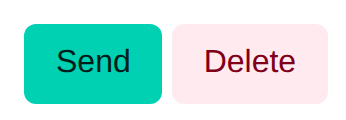
<div class="p-3">
  <button class="button is-primary">Send</button>
  <button class="button is-danger is-light">Delete</button>
</div>
Bulma works like Bootstrap with different names: button for the shape, is-primary, is-success or is-danger for the colour, is-large for the size.
id: bulma-button
<script src="tailwind.js"></script>
<button class="bg-blue-600 text-white px-4 py-2 rounded-lg">Join</button>
Example
<script src="tailwind.js"></script>

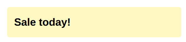
<p class="m-3 p-3 bg-yellow-100 text-lg font-bold rounded">Sale today!</p>
Tailwind has one class per CSS property: bg-blue-600 is the background, text-white the text colour, px-4 and py-2 the padding, rounded-lg the corners. Here tailwind.js writes the CSS as the page loads (for trying things); real sites use a build tool.
id: tailwind-utility-classes
<link rel="stylesheet" href="daisyui.css">
<script src="tailwind.js"></script>
<button class="btn btn-primary">Join</button>
Example
<link rel="stylesheet" href="daisyui.css">
<script src="tailwind.js"></script>

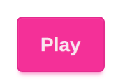
<div class="p-3">
  <button class="btn btn-secondary">Play</button>
</div>
daisyUI puts Bootstrap-style names (btn, card, alert) on top of Tailwind, so you can mix whole parts with Tailwind's one-property classes.
id: daisyui-button
<link rel="stylesheet" href="pico.classless.min.css">
<main>
  plain tags
</main>
Example
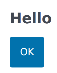
<link rel="stylesheet" href="pico.classless.min.css">

<main>
  <h3>Hello</h3>
  <button>OK</button>
</main>
Pico's classless version styles plain tags: a page with headings, paragraphs, forms and buttons looks tidy with no class names at all. Put the page in a <main>.
id: pico-no-classes