<p> paragraph
A paragraph of text.
<p>Some text</p>Example
<p>We meet on Tuesdays.</p>
<p>Everyone is welcome.</p>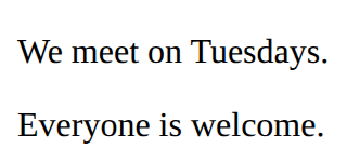
Pages with Bootstrap · In any playground, open Reference to copy these.
A paragraph of text.
<p>Some text</p><p>We meet on Tuesdays.</p>
<p>Everyone is welcome.</p>A picture. src is the picture file; alt describes it for people who cannot see it. There is no closing tag.
<img src="trophy.svg" alt="A gold trophy"><img src="medal.svg" alt="A silver medal" width="100">
<p>Second place</p>
Style every element matching the selector.
p {
  color: blue;
}<style>
li {
color: teal;
}
</style>
<ul>
<li>One</li>
<li>Two</li>
</ul>
The text colour.
color: red;<style>
em {
color: crimson;
}
</style>
<p>A <em>red</em> word</p>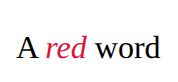
Which font to use.
font-family: sans-serif;<style>
p {
font-family: monospace;
}
</style>
<p>Code font</p>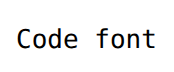
A box with room inside (padding), a line around it (border) and space outside it (margin). Width sets the content only.
.card {
  width: 200px;
  padding: 16px;
  border: 2px solid navy;
  margin: 12px;
}<style>
.card {
width: 200px;
padding: 16px;
border: 2px solid navy;
margin: 12px;
}
</style>
<section class="card">
<h2>Chess</h2>
<p>Wednesdays at lunch.</p>
</section>
A row that moves items to a new line when there is no room. flex: 1 lets items share the space and min-width stops them getting too narrow.
.gallery {
  display: flex;
  flex-wrap: wrap;
  gap: 12px;
}
.item {
  flex: 1;
  min-width: 150px;
}<style>
.gallery {
display: flex;
flex-wrap: wrap;
gap: 12px;
}
.item {
flex: 1;
min-width: 150px;
background-color: lightyellow;
}
</style>
<section class="gallery">
<p class="item">One</p>
<p class="item">Two</p>
<p class="item">Three</p>
<p class="item">Four</p>
</section>
Loads Bootstrap's stylesheet: a big CSS file someone else wrote. Put it first, above your own <style>. On your own site, download it from getbootstrap.com and put it beside your page.
<link rel="stylesheet" href="bootstrap.min.css">A centred column with space at the sides. Most Bootstrap pages put everything inside one.
<div class="container">
  content
</div>A coloured message box. alert gives the box; alert-primary, alert-success, alert-danger, alert-warning or alert-info picks the colour.
<div class="alert alert-warning">Message</div><link rel="stylesheet" href="bootstrap.min.css">
<div class="alert alert-info">The library is open at lunch.</div>
The bar across the top: the brand (your name) on the left, then the menu. navbar-expand keeps the menu in a row (folding it into a button on phones needs Bootstrap's JavaScript).
<nav class="navbar navbar-expand bg-body-tertiary">
  <div class="container">
    <a class="navbar-brand" href="#">Club name</a>
    <ul class="navbar-nav">
      <li class="nav-item"><a class="nav-link" href="#part">Link</a></li>
    </ul>
  </div>
</nav><link rel="stylesheet" href="bootstrap.min.css">
<nav class="navbar navbar-expand bg-body-tertiary">
<div class="container">
<a class="navbar-brand" href="#">Library</a>
<ul class="navbar-nav">
<li class="nav-item"><a class="nav-link" href="#">Books</a></li>
<li class="nav-item"><a class="nav-link" href="#">Hours</a></li>
</ul>
</div>
</nav>
Bootstrap's grid: a row lines up the cols inside it, and each col takes an equal share. col-4 and col-8 split the row 4 to 8 (a row is 12 parts). Put a row inside a container.
<div class="row">
  <div class="col">first</div>
  <div class="col">second</div>
</div><link rel="stylesheet" href="bootstrap.min.css">
<div class="container">
<div class="row">
<div class="col border">One</div>
<div class="col border">Two</div>
<div class="col border">Three</div>
</div>
</div>
Bulma works like Bootstrap with different names: button for the shape, is-primary, is-success or is-danger for the colour, is-large for the size.
<link rel="stylesheet" href="bulma.min.css">
<button class="button is-primary">Join</button><link rel="stylesheet" href="bulma.min.css">
<div class="p-3">
<button class="button is-primary">Send</button>
<button class="button is-danger is-light">Delete</button>
</div>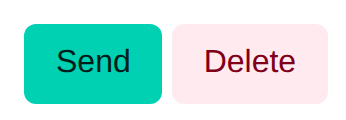
A file name with no folder means "beside this page"; images/trophy.svg means "in the images folder beside this page". Never a path from your own computer (C:/Users/…).
<img src="trophy.svg" alt="…">
<link rel="stylesheet" href="style.css">A note that the browser ignores.
<!-- A note to yourself --><p>You can see this.</p>
<!-- You cannot see this. -->
A button.
<button>Click me</button><button>Start</button>
Where CSS lives. Each rule is: selector { property: value; }
<style>
  h1 {
    color: red;
  }
</style><style>
h2 {
color: purple;
}
</style>
<h2>Purple heading</h2>
<p>Normal text</p>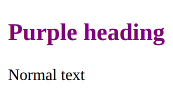
Style only the elements you mark with class="note" in the HTML. The dot is only in the CSS.
.note {
  color: red;
}<style>
.tip {
font-style: italic;
}
</style>
<p>A normal paragraph.</p>
<p class="tip">A paragraph with class="tip".</p>
The background colour.
background-color: lightyellow;<style>
h2 {
background-color: lightyellow;
}
</style>
<h2>Notice</h2>
A line around an element: thickness, style, colour.
border: 2px solid black;<style>
p {
border: 2px solid black;
}
</style>
<p>Boxed</p>
A row of items. gap is the space between them, justify-content places them along the row, align-items lines them up across it.
.row {
  display: flex;
  gap: 16px;
  justify-content: space-between;
  align-items: center;
}<style>
.bar {
display: flex;
gap: 16px;
justify-content: space-between;
align-items: center;
}
</style>
<section class="bar">
<h2>Chess club</h2>
<p>Join us</p>
</section>
A chunk of HTML with a class. Copy the section for each card; one rule styles every copy.
<style>
  .card {
    padding: 16px;
    border: 1px solid gray;
  }
</style>
<section class="card">
  <h2>Title</h2>
  <p>Some text.</p>
</section><style>
.card {
padding: 16px;
border: 1px solid gray;
}
</style>
<section class="card">
<h2>Chess</h2>
<p>Wednesdays.</p>
</section>
<section class="card">
<h2>Art</h2>
<p>Thursdays.</p>
</section>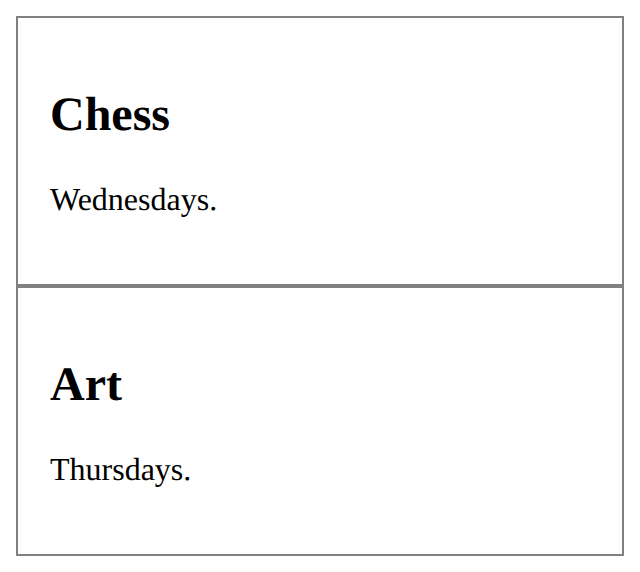
btn gives the button shape; a second class picks the colour: btn-primary, btn-secondary, btn-success, btn-danger, btn-warning, or btn-outline-primary for an outline. Add btn-lg or btn-sm for the size. It needs both btn and a colour.
<button class="btn btn-primary">Join</button><link rel="stylesheet" href="bootstrap.min.css">
<button class="btn btn-primary">Save</button>
<button class="btn btn-outline-secondary">Cancel</button>
<button class="btn btn-danger btn-sm">Delete</button>
m is margin and p is padding; then t, b, s, e (top, bottom, start, end), x (both sides) or y (top and bottom), then a size from 0 to 5: mt-3 is a space above. text-center centres text; lead makes a larger opening paragraph; fw-bold makes it bold.
<p class="mt-3 p-2 text-center">Text</p><link rel="stylesheet" href="bootstrap.min.css">
<p class="lead text-center">Welcome!</p>
<p class="mt-4 p-3 border">A box with space above and padding inside.</p>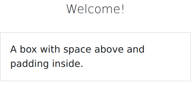
A box with a border and rounded corners. The card-body inside gives it padding; card-title and card-text style what is in it.
<div class="card">
  <div class="card-body">
    <h5 class="card-title">Title</h5>
    <p class="card-text">Text</p>
  </div>
</div><link rel="stylesheet" href="bootstrap.min.css">
<div class="card m-2">
<div class="card-body">
<h5 class="card-title">Robotics</h5>
<p class="card-text">Fridays in the lab.</p>
</div>
</div>
Bootstrap's look for a form: form-label on each label, form-control on each box, form-select on a drop-down. The for and id still link them.
<label for="email" class="form-label">Email</label>
<input id="email" type="email" class="form-control"><link rel="stylesheet" href="bootstrap.min.css">
<div class="m-2">
<label for="town" class="form-label">Town</label>
<input id="town" type="text" class="form-control">
</div>
Bootstrap's look for a table: lines between rows and padding in the cells. table-striped shades every other row; table-bordered adds borders.
<table class="table table-striped">
  rows
</table>Says what a picture shows, for anyone who can't see it (screen readers read it aloud). Use alt="" for a picture that is only decoration.
<img src="trophy.svg" alt="A gold trophy">Headings are the page's outline: one h1, then h2 for each part, h3 inside those. Never pick a level for its size; set the size with CSS.
<h1>Page title</h1>
<h2>A part of the page</h2>
<h3>A part of that part</h3>