<ul> list
A bulleted list. Each item is an <li>.
<ul>
  <li>First</li>
  <li>Second</li>
</ul>
Example
<ul>
  <li>Apples</li>
  <li>Pears</li>
  <li>Plums</li>
</ul>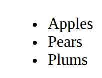
Structure and style a page · In any playground, open Reference to copy these.
A bulleted list. Each item is an <li>.
<ul>
<li>First</li>
<li>Second</li>
</ul><ul>
<li>Apples</li>
<li>Pears</li>
<li>Plums</li>
</ul>A note that the browser ignores.
<!-- A note to yourself --><p>You can see this.</p>
<!-- You cannot see this. -->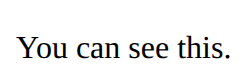
Style only the elements you mark with class="note" in the HTML. The dot is only in the CSS.
.note {
  color: red;
}<style>
.tip {
font-style: italic;
}
</style>
<p>A normal paragraph.</p>
<p class="tip">A paragraph with class="tip".</p>
A box with room inside (padding), a line around it (border) and space outside it (margin). Width sets the content only.
.card {
  width: 200px;
  padding: 16px;
  border: 2px solid navy;
  margin: 12px;
}<style>
.card {
width: 200px;
padding: 16px;
border: 2px solid navy;
margin: 12px;
}
</style>
<section class="card">
<h2>Chess</h2>
<p>Wednesdays at lunch.</p>
</section>
A row that moves items to a new line when there is no room. flex: 1 lets items share the space and min-width stops them getting too narrow.
.gallery {
  display: flex;
  flex-wrap: wrap;
  gap: 12px;
}
.item {
  flex: 1;
  min-width: 150px;
}<style>
.gallery {
display: flex;
flex-wrap: wrap;
gap: 12px;
}
.item {
flex: 1;
min-width: 150px;
background-color: lightyellow;
}
</style>
<section class="gallery">
<p class="item">One</p>
<p class="item">Two</p>
<p class="item">Three</p>
<p class="item">Four</p>
</section>
A numbered list.
<ol>
  <li>First</li>
  <li>Second</li>
</ol><ol>
<li>Plug in</li>
<li>Switch on</li>
<li>Press start</li>
</ol>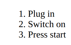
A link. The address goes in href; the words between the tags are what people click.
<a href="https://example.com">Link text</a><p>Read the <a href="https://example.com">club rules</a>.</p>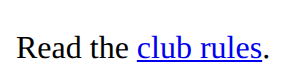
A picture. src is the picture file; alt describes it for people who cannot see it. There is no closing tag.
<img src="trophy.svg" alt="A gold trophy"><img src="medal.svg" alt="A silver medal" width="100">
<p>Second place</p>
How big the text is.
font-size: 20px;<style>
h2 {
font-size: 40px;
}
</style>
<h2>Big</h2>
<p>Normal</p>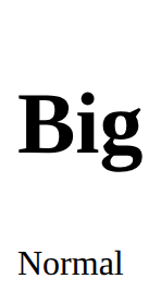
A row of items. gap is the space between them, justify-content places them along the row, align-items lines them up across it.
.row {
  display: flex;
  gap: 16px;
  justify-content: space-between;
  align-items: center;
}<style>
.bar {
display: flex;
gap: 16px;
justify-content: space-between;
align-items: center;
}
</style>
<section class="bar">
<h2>Chess club</h2>
<p>Join us</p>
</section>
Says what a picture shows, for anyone who can't see it (screen readers read it aloud). Use alt="" for a picture that is only decoration.
<img src="trophy.svg" alt="A gold trophy">A file name with no folder means "beside this page"; images/trophy.svg means "in the images folder beside this page". Never a path from your own computer (C:/Users/…).
<img src="trophy.svg" alt="…">
<link rel="stylesheet" href="style.css">